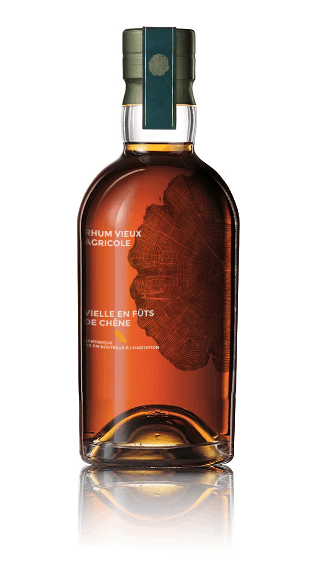
The design of a whiskey bottle to translate the elegance of time
Label agence wanted to represent the beauty of the soul of whisky “Fût un temps”. As for us, a spirit improves over time and matures.
The beauty of time: it is from this observation that Label Agence started to create refined packaging for this bottle. A chic and minimalist visual that recalls the very essence of this French single malt.
The grooves in the woodcut remind us of the passing of time, and the indication of the ripening of this whisky, which has aged in casks. These age rings are like fingerprints: it’s her DNA. These stigmas are as many traces of our passage: the wood gives the whisky its woody and resinous notes, which give the spirit this maturity and amber colour. This is why we have chosen these motifs to illustrate the packaging of this bottle.
A woody smell that can be felt when you see the bottle. The visual is both an ode to the cycle of life, but also to the future: a sober and refined design.
Label Agence, creative agency 4.0, implements new and unique concepts for spirits brands. Label Agence, in partnership with “Spirits Hunters”, created SH’s website and Progressive Web App, dedicated to the world of spirits and blends.
Don’t drink and drive. Enjoy responsibly.
News
Stay tuned and discover all the news in the Spirits World for professionals and amateurs, by our Spirits Hunters’ experts.
See all posts in this category. Join the community on Reddit
Spirits Hunters is a community dedicated to spirits and the world of mixology. Feel free to talk about the world of mixology and bartending here!
Join